
JioPOS — India's Largest Telecom Retail Platform
Redesigned 40+ user journeys for 500K+ retail agents across India, reducing activation-related support calls and establishing a unified design system as the JioPOS platform standard.
 Jio Platforms Ltd.
 JioPOS had 40+ fragmented journeys with no coherent UX layer, causing high support call volumes for 500,000+ retail agents across India.
Led a research-grounded redesign across 40+ journeys, defined three core design principles, and built a reusable pattern library in parallel.
40+ journeys redesigned, design system adopted as platform standard, measurable reduction in activation-related support calls.
UX Audit
Evaluated the 12 most-used journeys against established UX heuristics, documenting failure points and scoring severity. This gave the team a clear, prioritised evidence base for what to fix first.
Contextual Research
Ran contextual inquiry sessions with agents in two tier-2 cities alongside the audit. Key insight: agents don't read error messages. They scan for colour and pattern. This changed the entire design direction.
Principle Definition
From research synthesis, defined three guiding principles: Status at a glance, Guided over open, and Graceful degradation. These kept 40+ redesigns coherent without requiring alignment meetings per journey.
Pattern Library Build
Redesigned journeys while building a pattern library in parallel, so every new flow added to a reusable system rather than creating new one-off components. The library became the onboarding reference for new team members.
CHALLENGE
A platform built without UX
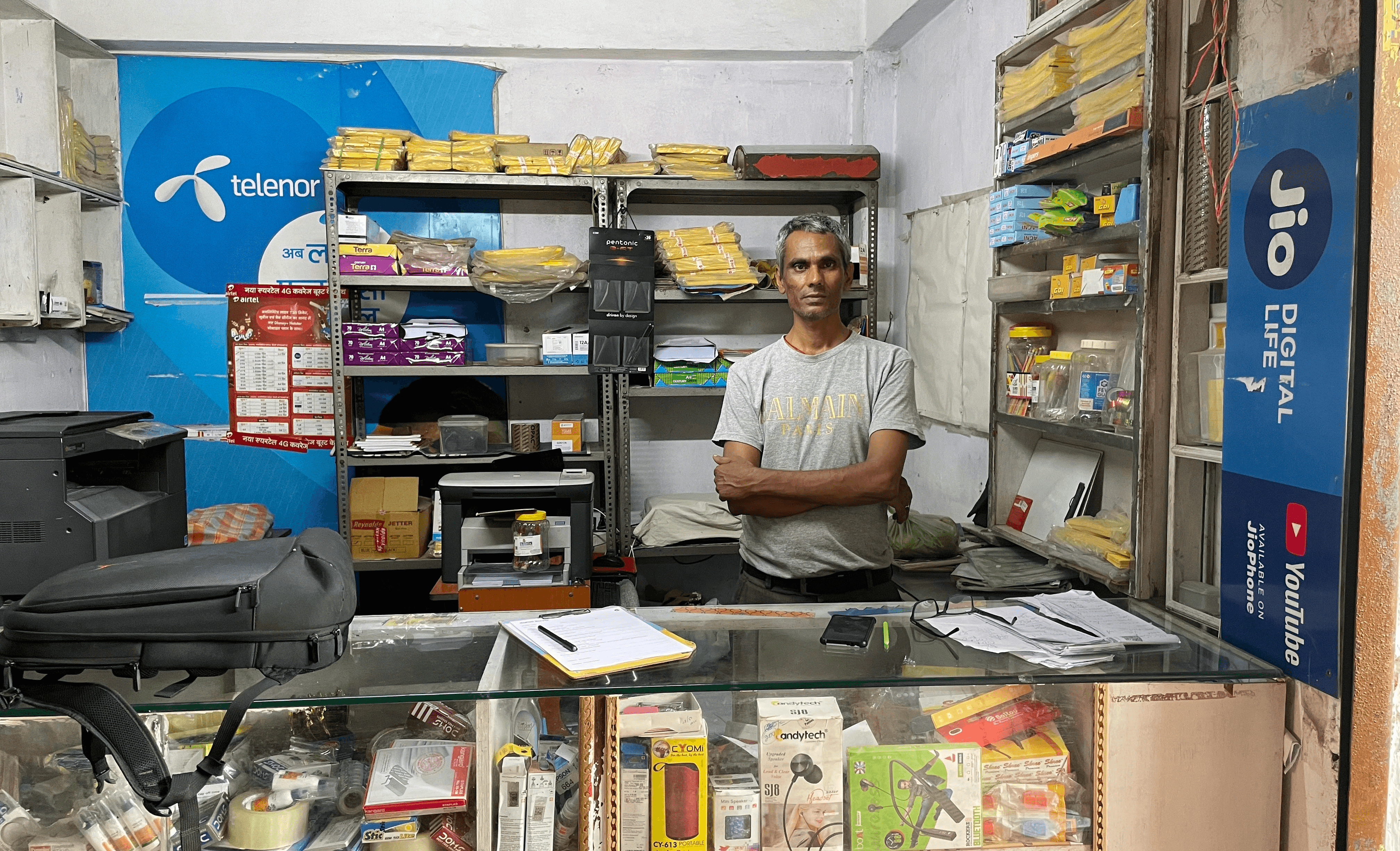
JioPOS is the point-of-sale and service management platform used by Jio’s retail agent network across India, covering over 500,000 agents responsible for SIM activations, plan upgrades, and customer service at the last mile.
When I joined the project, the platform had accumulated years of feature additions without a coherent UX layer. Activation flows were fragmented, error states were unhelpful, and agents routinely called support for tasks the system should have made self-evident.
A second constraint arrived simultaneously: Jio was transitioning to a new era of design-led innovation, introducing the Jio Design System (JDS) — a universal design identity across all Jio 2.0 products. JioPOS was expected to adopt JDS, which meant the redesign wasn’t just about fixing UX problems. It was about integrating a new design language into a mission-critical platform serving 500,000+ active users without disrupting their daily workflows.
The deeper constraint: JioPOS had to work equally well for agents in tier-1 cities with fast devices and stable internet, and for agents in rural tier-3 locations with slow connectivity, older hardware, and intermittent network.
APPROACH
Discovery & field research first
Before designing anything, I worked with real retailers to understand edge cases, pain points, and process breakdowns across geographies and device types. This field research surfaced the most important behavioural insight of the project: agents don’t read error messages. They scan for colour and pattern. Red means something is wrong; they call support. The platform was over-relying on text-heavy modals.
A UX audit across the 12 most-used journeys established the evidence base. From this synthesis, I defined three design principles that kept 40+ redesigns coherent without requiring an alignment meeting for every decision:
- Status at a glance: critical information always visible, never buried
- Guided over open: lead agents through multi-step journeys with clear progress indicators
- Graceful degradation: every critical workflow must function in a reduced mode with no internet
STRATEGY
JDS integration + TRAI compliance
The work proceeded on two parallel tracks:
Design System integration: Collaborated with an external agency to build the foundational design system aligned with JDS, then expanded it in-house with product and engineering teams. Every component was designed to be modular and reusable, supporting scaling across future Jio services.
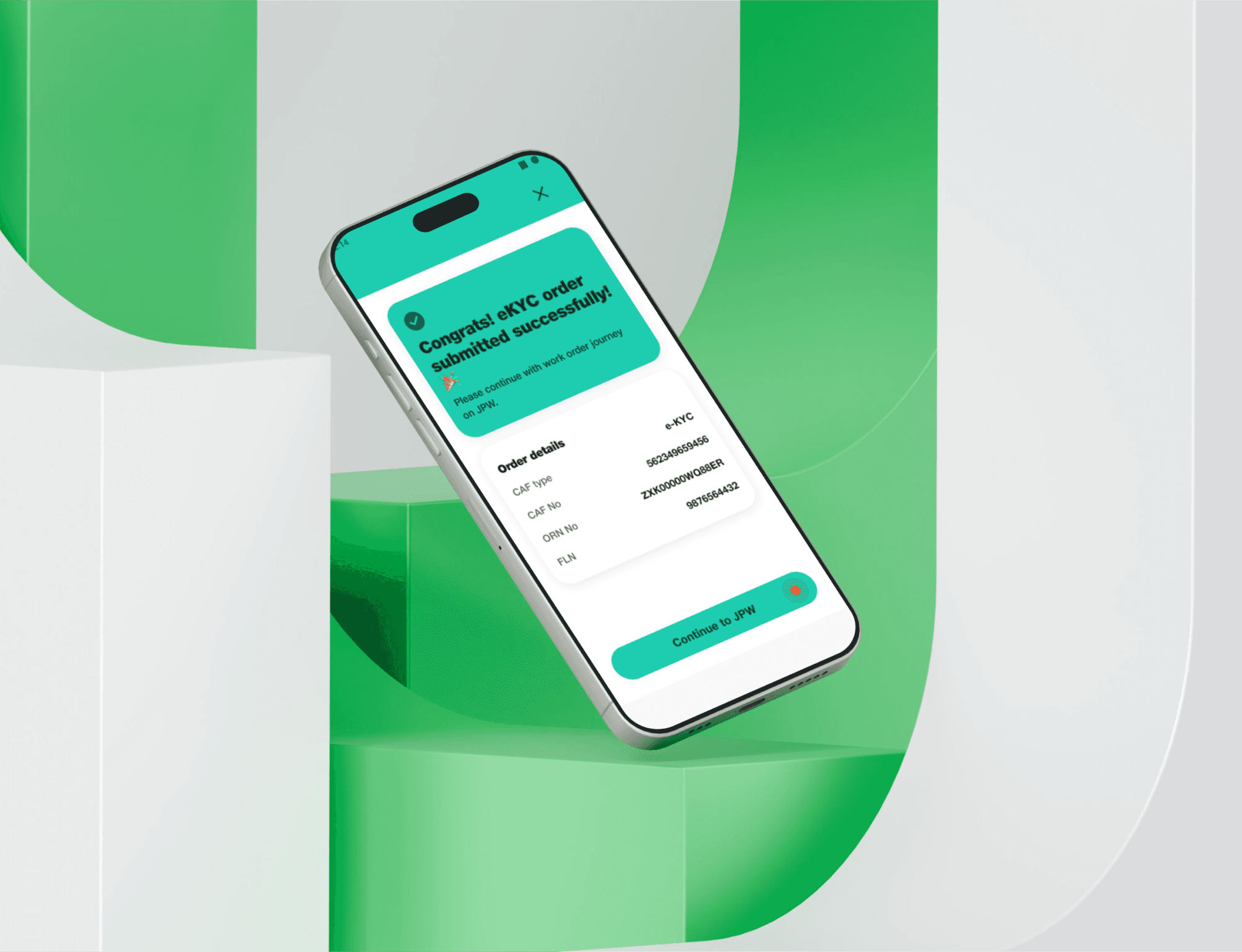
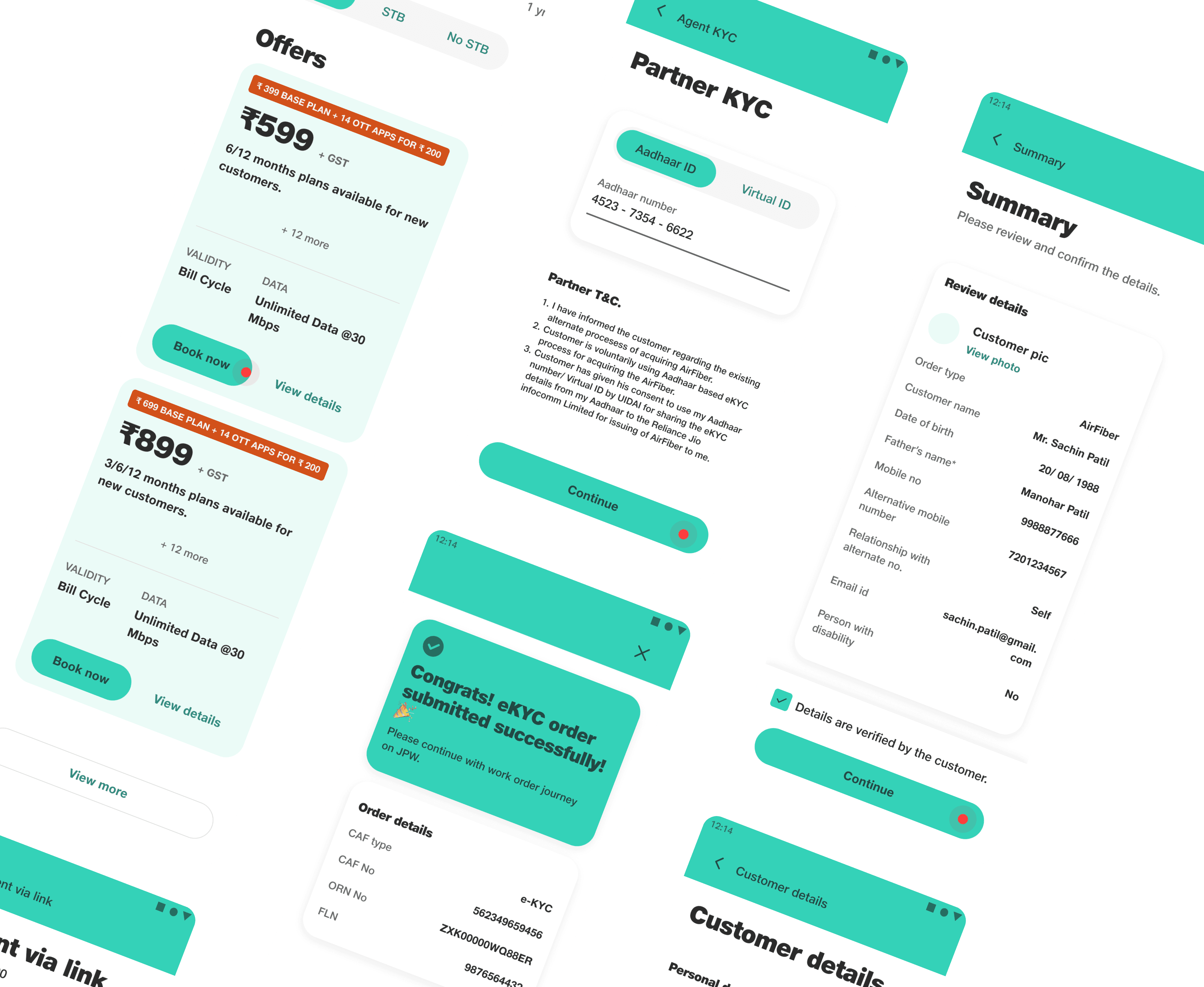
TRAI Compliance & Journey Redesign: Redesigned key regulated flows (eKYC, SIM activation, and device registration) to meet TRAI requirements. The challenge was achieving full legal compliance without making the process feel like a compliance exercise. Complex multi-step regulatory tasks were simplified into clear, guided journeys that worked for both tech-confident urban agents and first-time users in remote markets.
I redesigned journeys while building the pattern library in parallel, so each new flow contributed to a reusable system rather than generating more one-off components.
RESULTS
Consistent UX at scale
40+ journeys redesigned with consistent, research-backed patterns. The design system became the reference standard for the broader JioPOS team and was adopted for all new feature development. Activation-related support call volume dropped measurably post-launch.
The redesigned JioPOS app significantly improved onboarding speed and reduced failure rates in key workflows. It continues to be one of the most widely used B2B apps within Jio’s ecosystem.

JioPOS continues to be one of the most widely used B2B platforms within Jio’s ecosystem. The pattern library and design principles established during this project became the onboarding reference for new designers and the standard for all subsequent feature development.