
Jio-BlackRock Investments — Onboarding UX
Led UX research, onboarding design, and cross-org alignment for the Jio Financial Services and BlackRock investments app, targeting first-time investors across India.
 Jio Platforms Ltd.
 Design an investments app for first-time Indian investors approaching mutual funds and digital wealth management for the first time, balancing trust, guidance, and regulatory clarity.
Research across metros and tier-2 cities to understand financial behaviours and digital comfort. Facilitated joint discovery workshops with Jio and BlackRock teams. Built and tested prototypes focused on trust, onboarding clarity, and drop-off reduction.
Onboarding framework and design system approved by both Jio Financial and BlackRock. Drop-off reduced in prototype testing. Figma component library handed off to engineering as the development foundation.
Research & Foundations
Conducted user interviews and contextual inquiry across metros and tier-2 cities to understand financial behaviours, digital comfort levels, and hesitations around investing. Synthesised findings into personas and journey maps centred on trust, guidance, and task clarity.
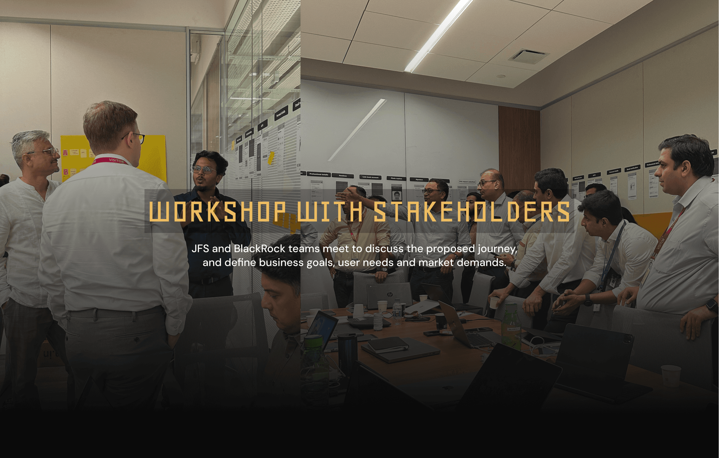
Stakeholder Workshops
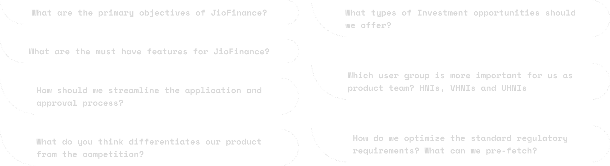
Facilitated joint discovery workshops with BlackRock and Jio teams, aligning on feature priorities, regional sensitivities, regulatory constraints, brand direction, and core onboarding principles. Two large organisations with different operational cultures required careful facilitation.
Prototyping & Testing
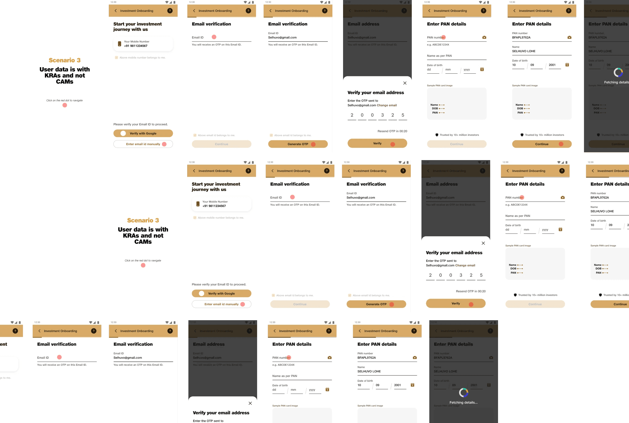
Built low-to-high fidelity prototypes to test onboarding clarity, comprehension of financial terms, and drop-off points. Led A/B tests and preference studies collecting feedback on design tone, flow pacing, and visual hierarchy.
UX Architecture & Design System
Shaped the information hierarchy for onboarding, dashboard, and KYC integration. Built shared component foundations in Figma in collaboration with engineering, designed for extensibility across future features including advisory tools and portfolio management.
CHALLENGE
First-time investors, high-stakes first impressions
As part of Jio Financial Services’ collaboration with BlackRock, the goal was to design a next-generation investments app for Indian users entering the world of mutual funds and digital wealth management, many for the very first time.
The product needed to accomplish several things simultaneously: communicate trustworthiness in a space where users are acutely sensitive to risk, simplify financial language without losing accuracy, navigate complex regulatory requirements for KYC and onboarding, and stand out in an increasingly crowded fintech market.
The challenge is deceptive. Finance UX looks simple from the outside: clean cards, a few numbers, a prominent CTA. But the process involves deep compliance requirements, tone calibration across literacy levels, and the constant risk of a single confusing step causing a user to abandon an app they may never return to.
RESEARCH
We started with field research rather than assumptions. User interviews and contextual inquiry across metro and tier-2 cities surfaced three themes that shaped the entire design direction:
Trust before features. First-time investors don’t evaluate apps by feature sets. They evaluate them by feel. Does this look legitimate? Does it feel like something I’d lose money on? Trust signals had to be embedded from the first screen.
Jargon is a barrier, not a sign of sophistication. Terms like NAV, SIP, and TER were consistently misunderstood or anxiety-inducing. The design had to communicate financial concepts in plain language without creating the impression of a toy product.
Guidance over exploration. Users in early investing stages don’t want an open canvas. They want to be led. Onboarding needed to feel like talking to a knowledgeable advisor, not opening a settings menu.
STRATEGY
Alignment across two organisations
Facilitating joint discovery workshops with both BlackRock and Jio teams was as important as the design work itself. Two large organisations, each with distinct brand values, regulatory sensitivities, and product philosophies, needed a shared vocabulary before a single wireframe made sense.
These workshops produced aligned onboarding principles, a prioritised feature list, and agreement on tone: approachable without being casual, confident without being intimidating.
From this foundation, design proceeded in tested iterations. Low-fidelity prototypes validated information architecture. Mid-fidelity flows were tested for comprehension: specifically, whether users understood what they were agreeing to at each step. High-fidelity prototypes tested for emotional response and flow pacing.
KEY DESIGN CHALLENGES
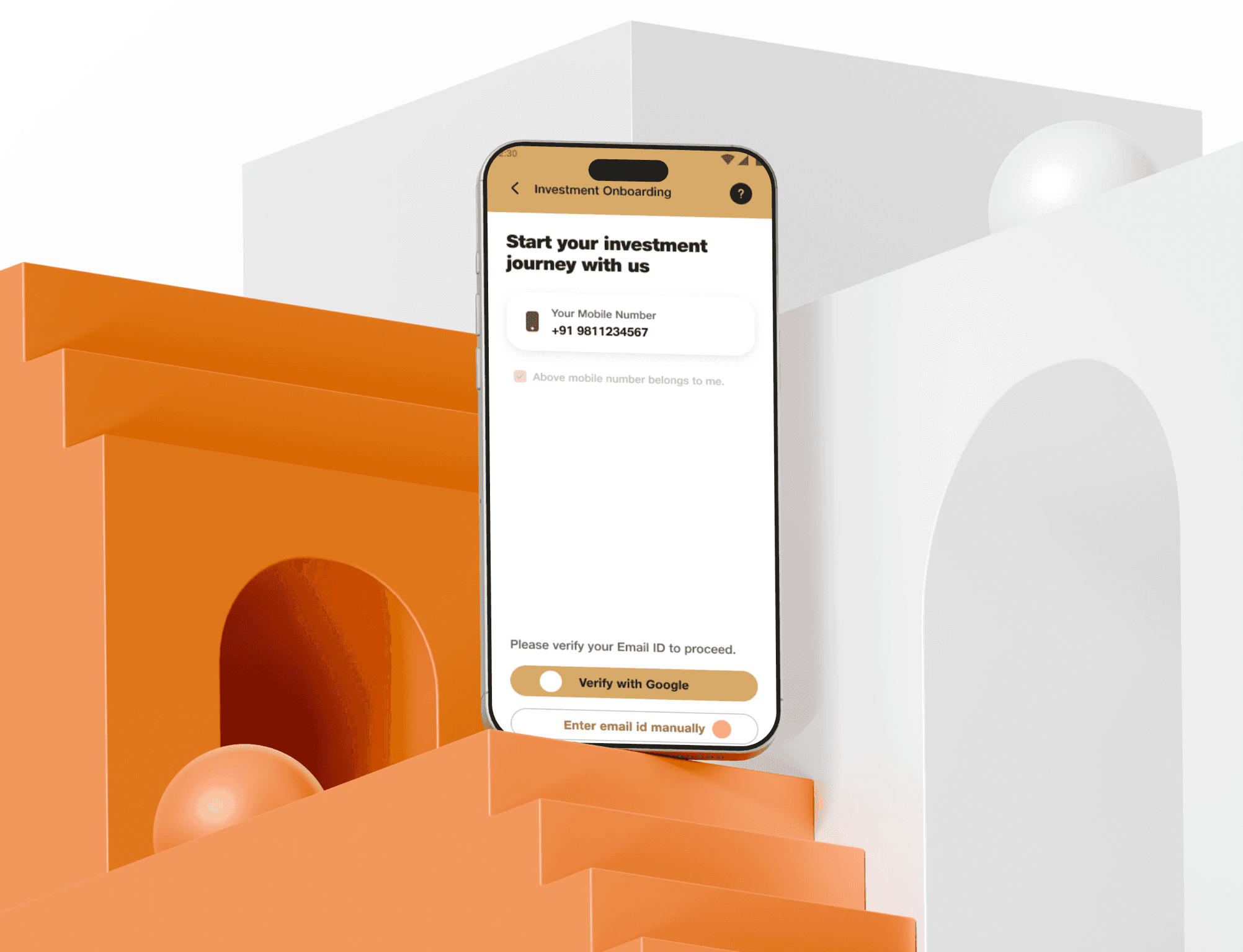
Onboarding as guided decision-making: The KYC and onboarding flow had to satisfy regulatory requirements while feeling like a natural conversation. Every mandatory field needed to feel purposeful, not bureaucratic.
Dashboard hierarchy for new investors: First-time users don’t have a portfolio to look at. The initial dashboard state needed to feel useful and orienting, not empty or anxiety-inducing.
Scalability for future features: The design system and information architecture had to accommodate future phases (advisory tools, goal-based investing, portfolio management) without requiring structural rework.
OUTCOME
The onboarding framework and design system were approved by both Jio Financial Services and BlackRock. Early prototype testing showed measurable drop-off reduction against baseline flows, and the Figma component library was handed off to engineering as the development foundation for future product phases.
The dual challenge here was meeting regulatory requirements for KYC and onboarding while calibrating tone and language for users who had never invested before, making every step feel purposeful rather than bureaucratic. That balance is the core competency this project demonstrated.